
Take an accelerated learning path through the "big three" probability distributions!
Three applets (one for each distribution) combine hands-on and visual learning to help you grasp the big picture in minimum time.
Setting Parameters and Running Simulations.
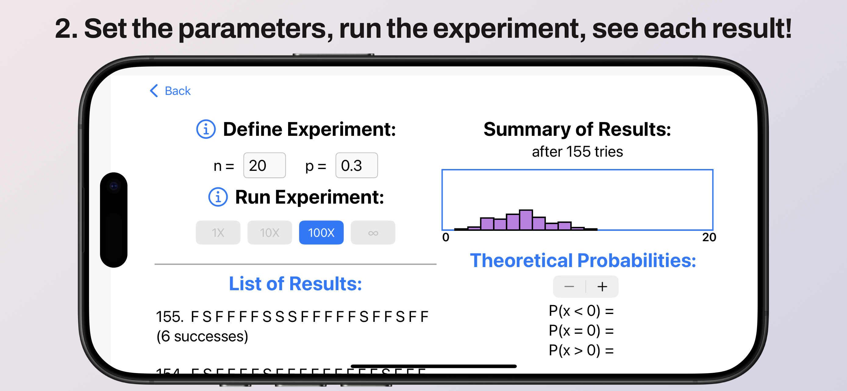
Below is a Bernoulli Trials experiment in progress. An example of a Bernoulli Trials "experiment" is to randomly roll 20 ten-sided dice (sides 1-10) and try to roll "3" or less (notice n is set to 20 and p to 0.3). This experiment has been run 155 times so far. See the full list of results below left, and the histogram top right. As you repeat the experiment, more results are added to both the list and the histogram!
Viewing Theoretical Probabilities.
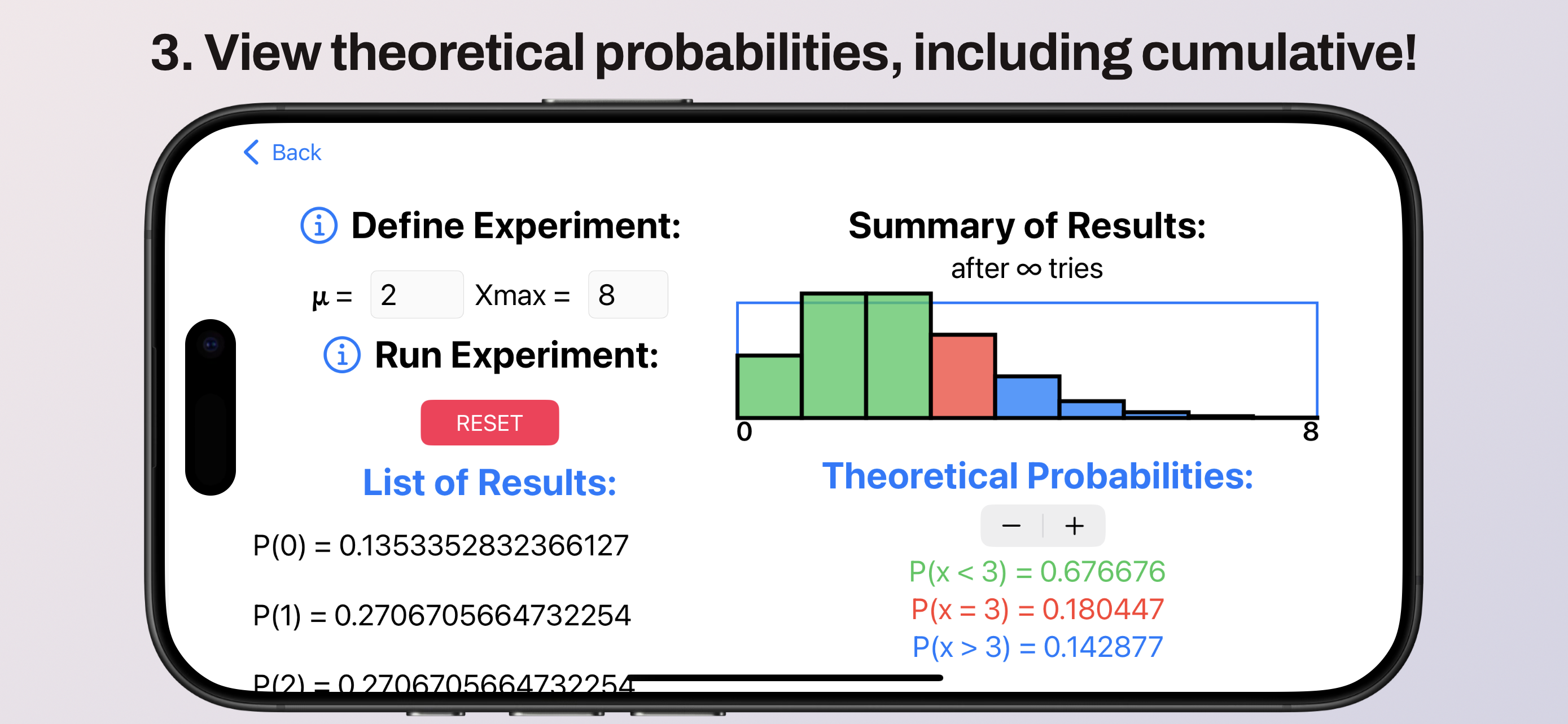
At the end of each simulation, the histogram switches to show the probability distribution, with the list of experimental results becoming a table of probabilities. In effect, these are the results you'd get if you ran the experiment and infinite number of times!
In the chart below, we've simulated a random arrival process (Poisson Distribution) where we expect 2 tornadoes to hit the county every June (say). Judging by the histogram, actually, it seems equally likely to be hit by 2 or 3 tornadoes in any given June!
Below right, you may use the stepper to set a less-than/greater-than cutoff value. This shows as a red bar in the histogram; the probability of exactly that many arrivals is printed below, also in red. You'll also see green corresponding to the probability of less than 3 arrivals, and blue to the probability of more than 3 arrivals. These must all add to 100%!
Riding the Bell Curve.
The Normal distribution doesn't need to be simulated directly. Both the Poisson and Binomial distributions, it turns out, approach a bell curve as the expected number of arrivals (Poisson) or the number of trials and successes (Binomial) are made very large!
One might consider, instead, the Poisson and Binomial distributions as applying to discrete, counted events like arrivals or "successes," and the Normal distribution as applying to continuous measurements like how many gallons of milk Bessie produces.
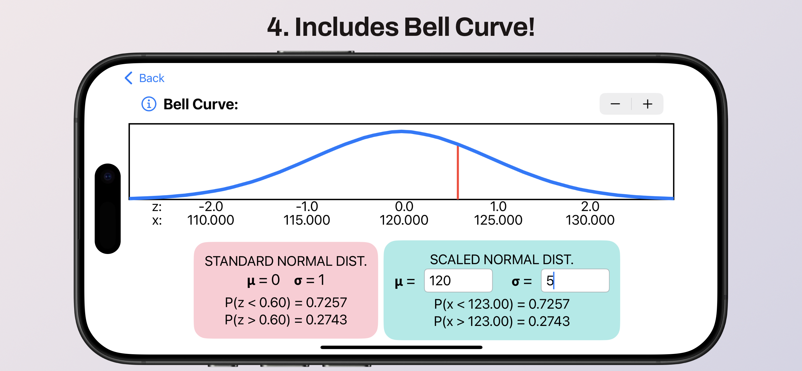
The Bell Curve applet, then, is not a simulation but a look-up tool. By using the stepper to set the z-score, the pink box displays the probability of a randomly-selected member of the population having a lower or higher z-score.
In the teal box, you have the option of defining a mean and standard deviation for a specific population. The probabilities below that show you which value of x has the set z-score. In other words: Here, we've set the mean to 120 and the standard deviation to 5. Since the z-score is 0.6, that tells us x = 123. The probabilities of finding a random member of the population with an x-value below, equal to, or above 123 are listed in the teal box.
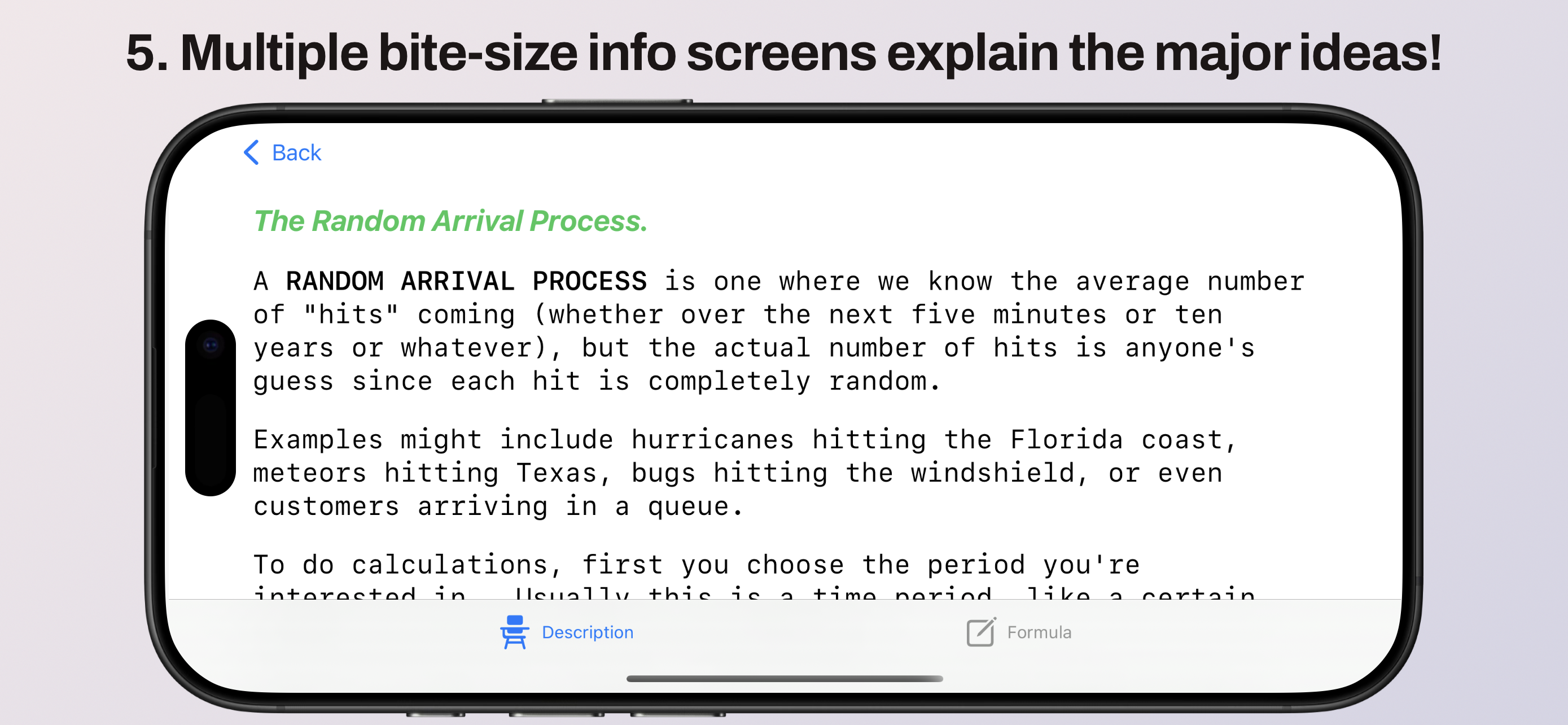
Embedded Mini-Lessons.
Of course, being your friendly neighborhood math instructor, I've included a few tabs of notes for each of the distributions. These fill you in on all the essential details you need to fully understand the applets.
Quick Access to Any of the Above.
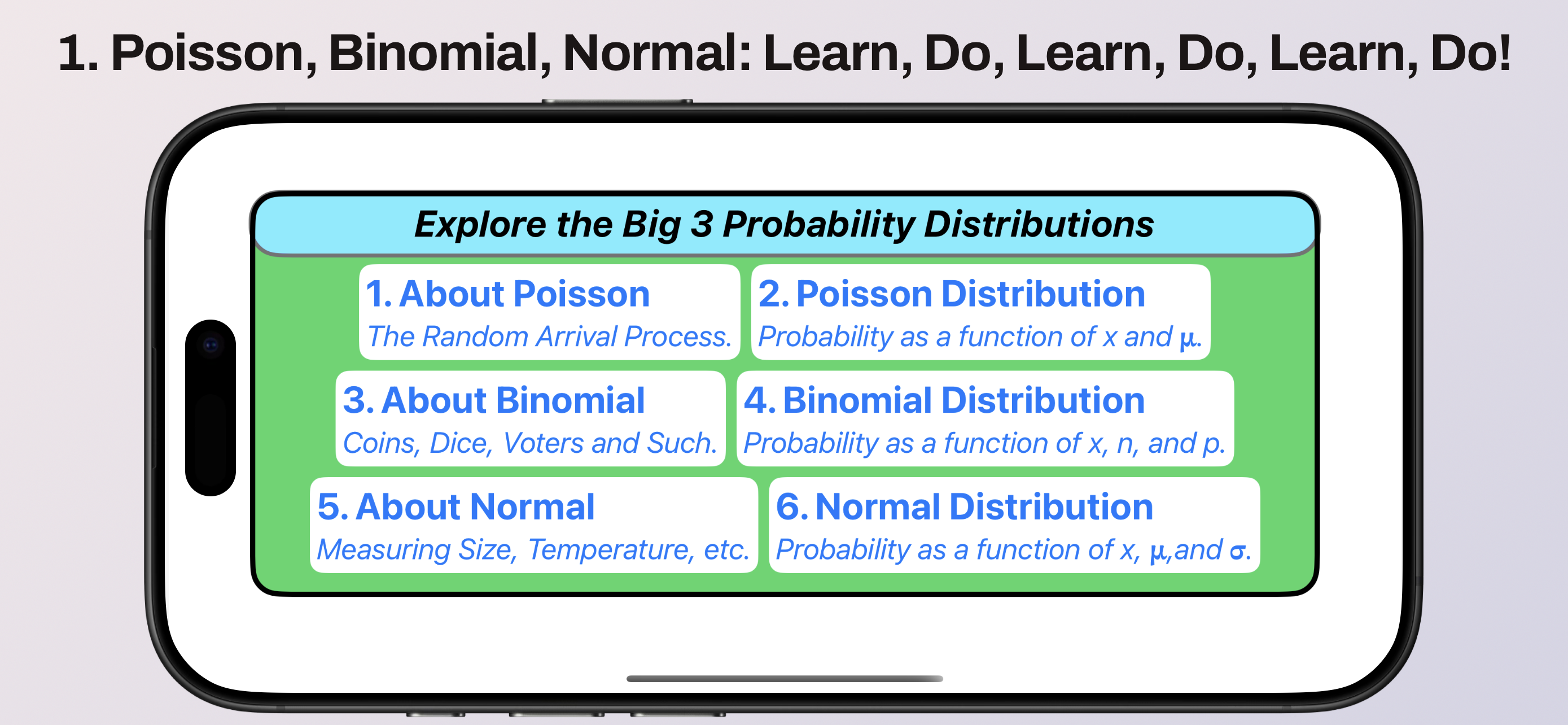
All of the above features are easily reached from the app's opening screen:
There you have it: over two weeks of my math course, distilled to a single, accelerated-learning app! I began using this app last semester, and had really good success. I even got a couple of unsolicited thankyous! After making a few little improvements, this app is ready for use by other students and instructors alike.
If this looks useful to you, please follow either link in the upper corners to download from the App Store (for both iPhone and iPad). At only a dollar, it's the next best thing to open source!